Building trust into AI-powered comment management for eCommerce brands.
Role
Product Designer
Team
Lauren Liang
Keiko Kobayashi
Shania Chacon
Valerie Peng
Timeline
2025 · 10 Weeks
Tools
Figma
V0
Prototyping
My Focus
I owned rules, brand voice, and the final inbox
I focused on the highest-risk areas: the features that determined whether the AI's output would be reliable enough for operators to trust with real customers.


What Shipped
Automation: plain language over technical logic
Rules that read like sentences, not code. "When someone asks about shipping, reply with tracking info." A dedicated builder with mandatory sandbox testing before going live.
Brand voice: natural language over rigid controls
Describe the tone you want in natural language, then preview how responses sound. No rigid sliders or dropdowns.
The final inbox: scan fast, reply with context
Rows stay collapsed for fast scanning. Click to expand: full comment thread, original post, and AI draft with reasoning, all in one view.
Explorations
Early directions I killed
Two directions I explored and abandoned based on user feedback.
Rules that felt like programming
My first designs looked like logic builders with if/then statements. Users froze. I was designing for flexibility when I should have been designing for confidence.
Brand voice: real-time testing split attention
A split interface with voice guidelines on the left and live testing on the right. Users got stuck constantly context-switching.

Context
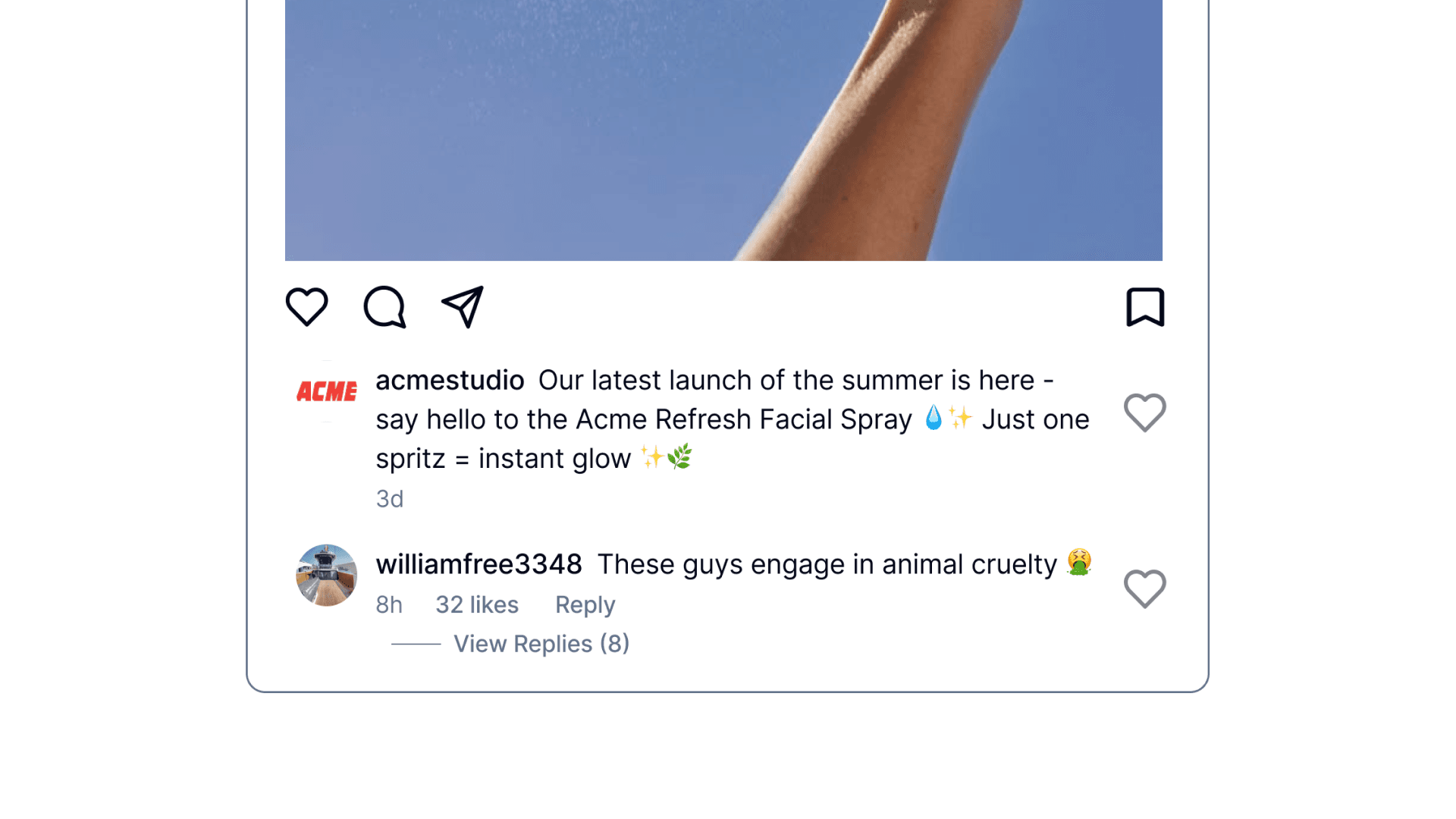
Every unanswered comment is a lost sale
A customer asks if a best-seller is back in stock. 47 people are watching. By morning, 12 bought from a competitor who replied first.
The Real Problem
It's not capability. It's reliability.
Every growth lead we interviewed had tried AI tools and stopped. The output was unreliable and they couldn't trust it to represent their brand.
“Don't fully trust AI yet, but open to automation once I trust it over time.”
Growth Lead, $3M DTC skincare brand
The Pivot
Our entire ICP flipped halfway through
Mid-project, we learned mid-sized eCommerce teams were the real opportunity, not startup founders. We chose speed: V0 for rapid prototypes, weekly testing, and reducing ambiguity fast enough to ship.
Assumed
Startup founders
Solo operators, low volume, price-sensitive
Discovered
Mid-sized eComm teams
$2M+ revenue, high volume, trust-focused
Design Principle
AI assists first. Automates only when trusted.
Every feature had to guarantee the AI's output was consistent, on-brand, and something operators would confidently send to real customers.
Impact
The numbers that matter
Over 10 weeks and 6 testing iterations. By the end, users weren't just approving AI suggestions. They were asking how to scale them.
33%
improvement in usability score
72.5
average SUS score, above industry benchmark
7/7
ease rating on final onboarding
6
weekly testing rounds
Reflection
What I learned
Key Learning
Reliability beats intelligence.
Users don't care how smart the AI is. They care whether it sounds like their brand every single time. Consistent, predictable output is what earns the trust to automate.
Key Learning
Pivots are a design skill.
When our ICP flipped mid-project, the instinct was to start over. Instead we identified what transferred and what didn't, then moved fast on the delta. Speed came from clarity, not panic.
Want to hear more?
This case study is the highlight reel. The real story has more texture: failed prototypes, scope debates, and the moment we almost shipped something that would have tanked trust. If you want the full picture, let's chat.